Google UX Design Certificate • Individual Concept Project
Maltby Movieplex
A responsive trailer-discovery concept connecting moviegoers with showtimes at a fictional local theater.
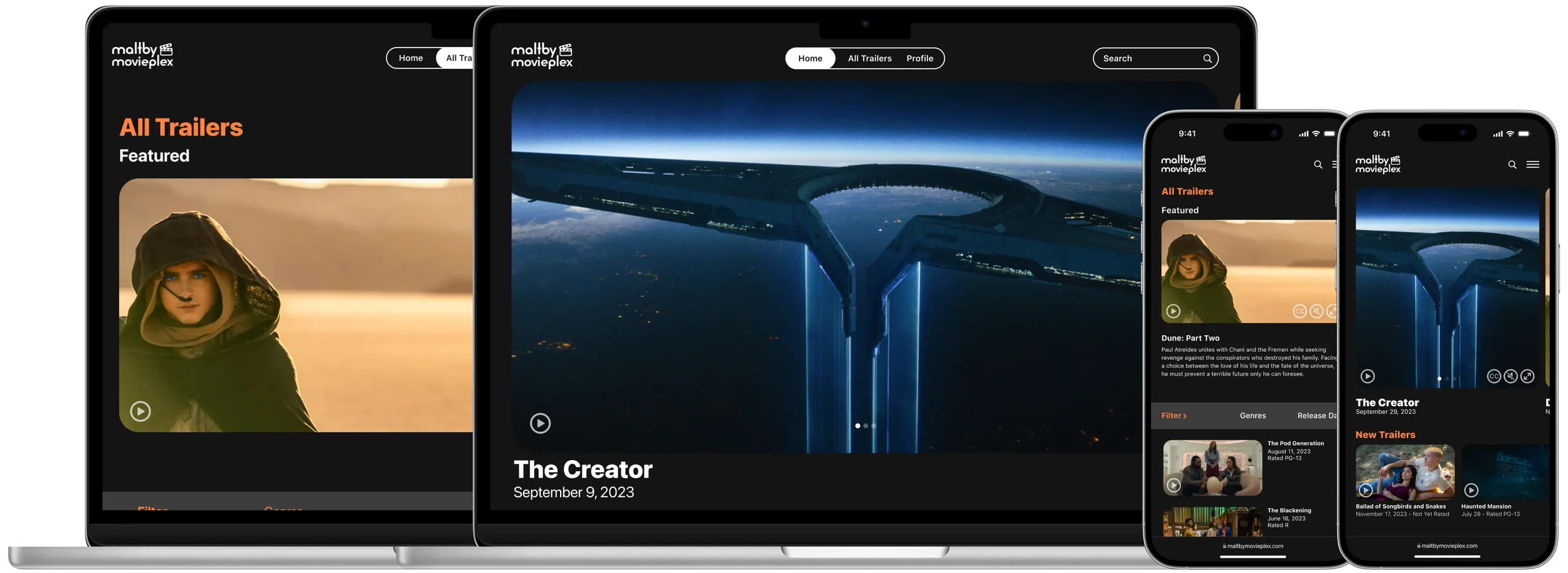
Context: Google UX Design Certificate
Brief: Sharpen-generated prompt for a responsive movie-trailer website
Role: Sole UX designer and researcher
Timeline: July – August 2023 • 7 weeks
Tools: Figma, Adobe Illustrator
Testing: 5 participants • 1 moderated prototype-testing round
Snapshot
Finding current movie trailers often meant searching across multiple websites with inconsistent navigation, limited filtering, and uneven caption support. The challenge was to create a focused, responsive experience that helped moviegoers discover trailers and move from browsing a current release to purchasing tickets from a fictional local theater.
Challenge
I designed a responsive concept for the fictional Maltby Movieplex that combines curated trailer browsing with movie details, showtimes, and a ticket-purchase flow. One round of moderated prototype testing led to clearer navigation labels, more informative desktop cards, and more scannable account settings.
Outcome
Defining the Problem
Research Framing
Maltby Movieplex began with a Sharpen-generated prompt rather than a real client brief. I used a fictional proto-persona and early journey mapping to explore two initial hypotheses: moviegoers may benefit from a focused place to browse current trailers, and the experience should adapt across desktop and mobile.
A review of existing trailer platforms also raised caption availability as an accessibility concern. These assumptions shaped the initial concepts and were later explored through one round of moderated prototype testing with five people from my personal network. Because this was a small convenience sample, the findings helped guide the design but are not representative of all moviegoers.
Proto-Persona
Taylor is a fictional proto-persona—not a research participant—used to keep the early concept focused on moviegoers who follow new releases but find trailer discovery fragmented across multiple platforms.
Initial Needs Explored
Focused discovery
Bring current and upcoming trailers into one browsable library.
Trailer-to-showtime connection
Help moviegoers move from a trailer for a currently playing film to available local showtimes.
Responsive browsing
Support comfortable navigation and filtering across desktop and mobile.
Accessible media information
Provide readable movie details and clearly visible caption controls.
Ideate & Prototype
Information Architecture
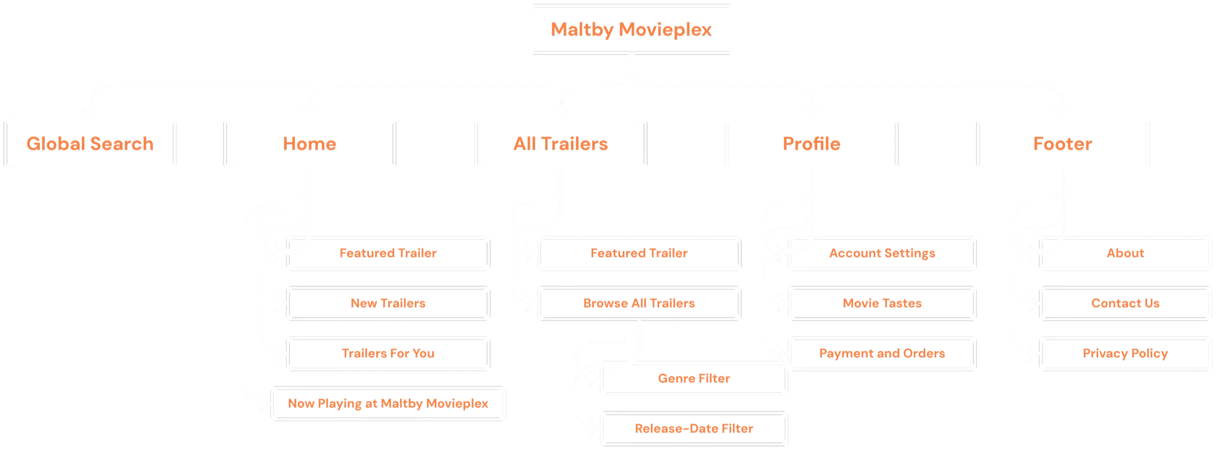
To design a responsive trailer library, I organized the concept around three primary destinations—Home, All Trailers, and Profile. Home supports discovery through featured, personalized, and now-playing collections. All Trailers supports broader browsing and filtering, while Profile gives people control over recommendations and account settings.
User Flow
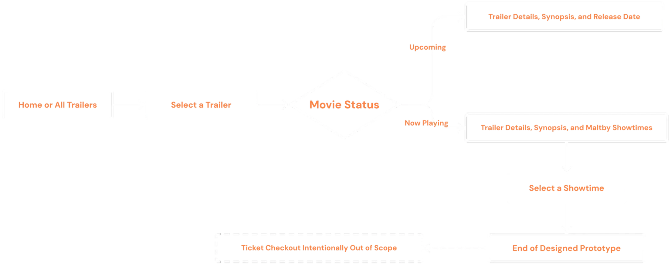
Selecting a trailer leads to movie details. Upcoming titles show availability, while now-playing movies add local showtimes.
Prototype scope ends after showtime selection; checkout is intentionally excluded.
Exploring Responsive Layouts
The desktop and mobile ideas did not always map one-to-one. Comparing them helped me explore how navigation, featured content, and trailer collections could reflow while preserving the same priorities.
Paper Wireframes
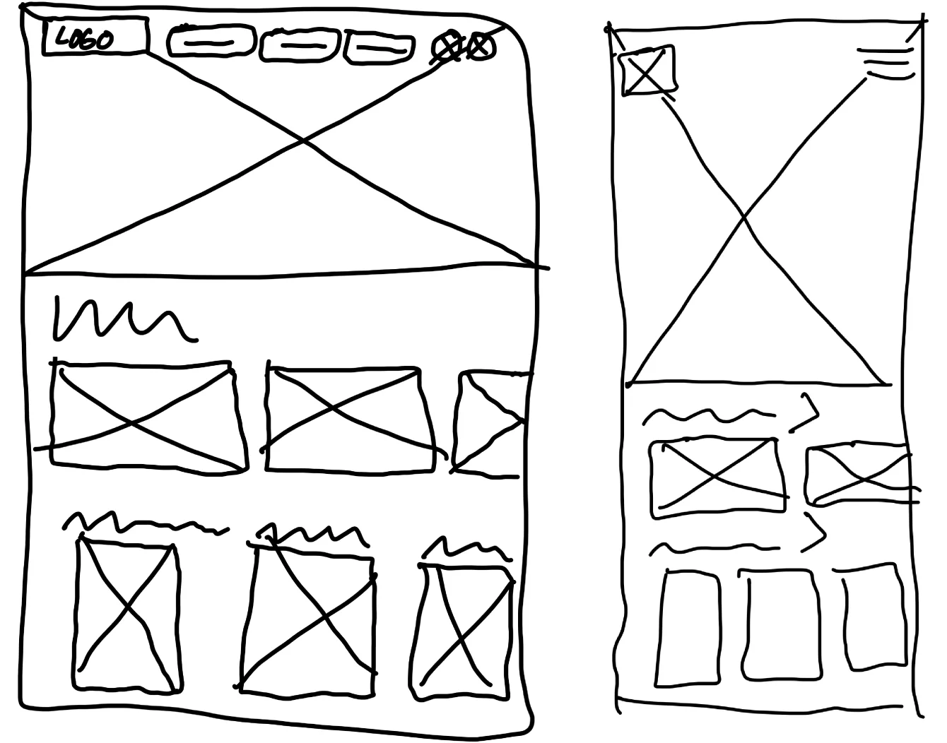
Direction 1 — Cinematic Browsing
A large featured trailer leads the hierarchy on both screens. Mobile changes the navigation and hero proportions without simply shrinking the desktop layout.
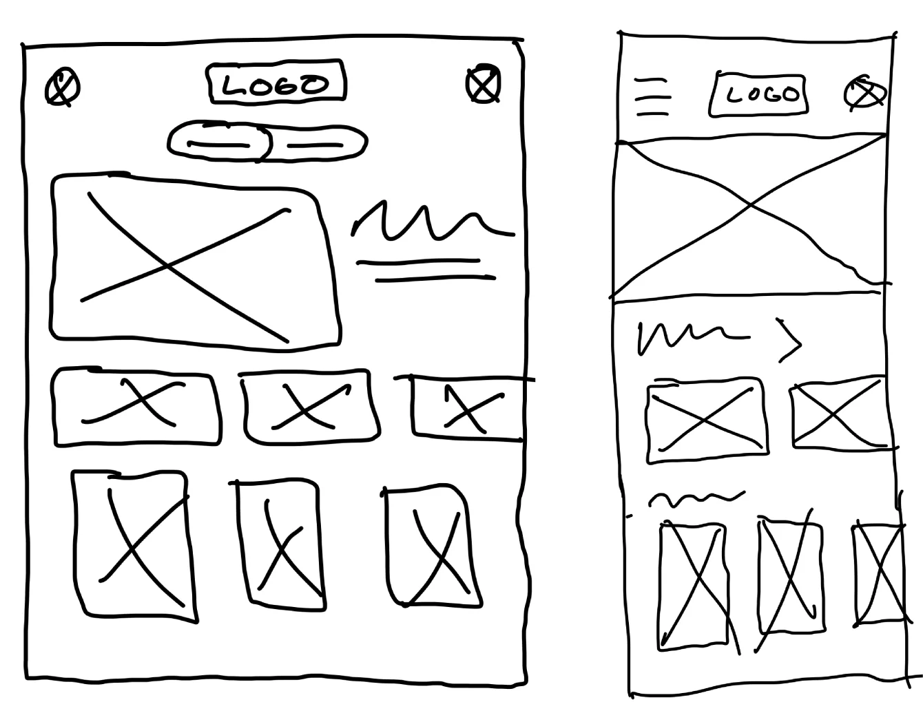
Direction 2 — Balanced Discovery
Movie information sits beside the desktop trailer, then stacks into a single mobile column while preserving the same sequence and priorities.
What I Carried Forward
Comparing the sketches helped me recognize that responsive design is not a one-to-one translation. The digital wireframes carried forward the cinematic direction, its featured trailer, and its collection-based browsing.
Digital Wireframes
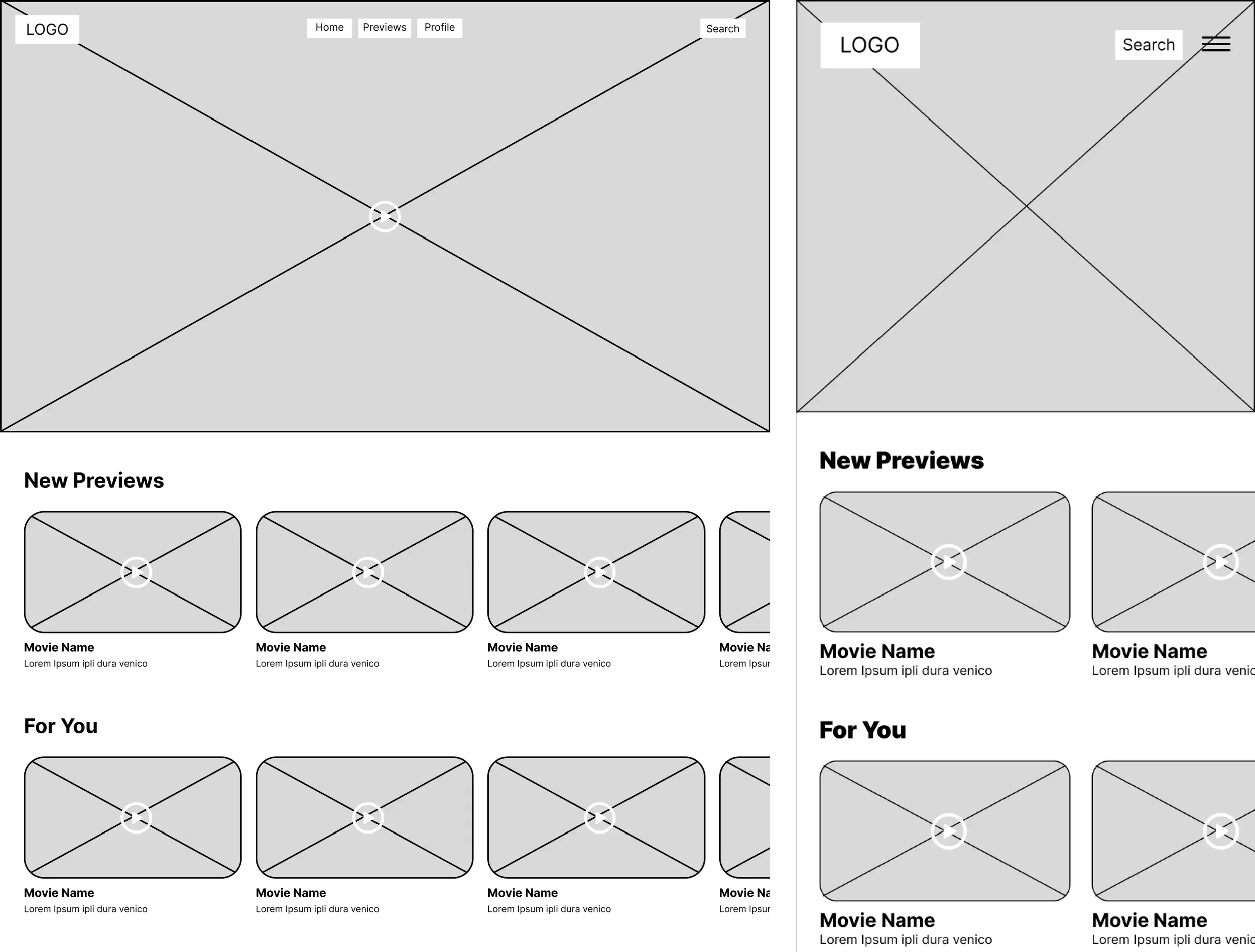
All new movie previews are curated here, right on the home page.
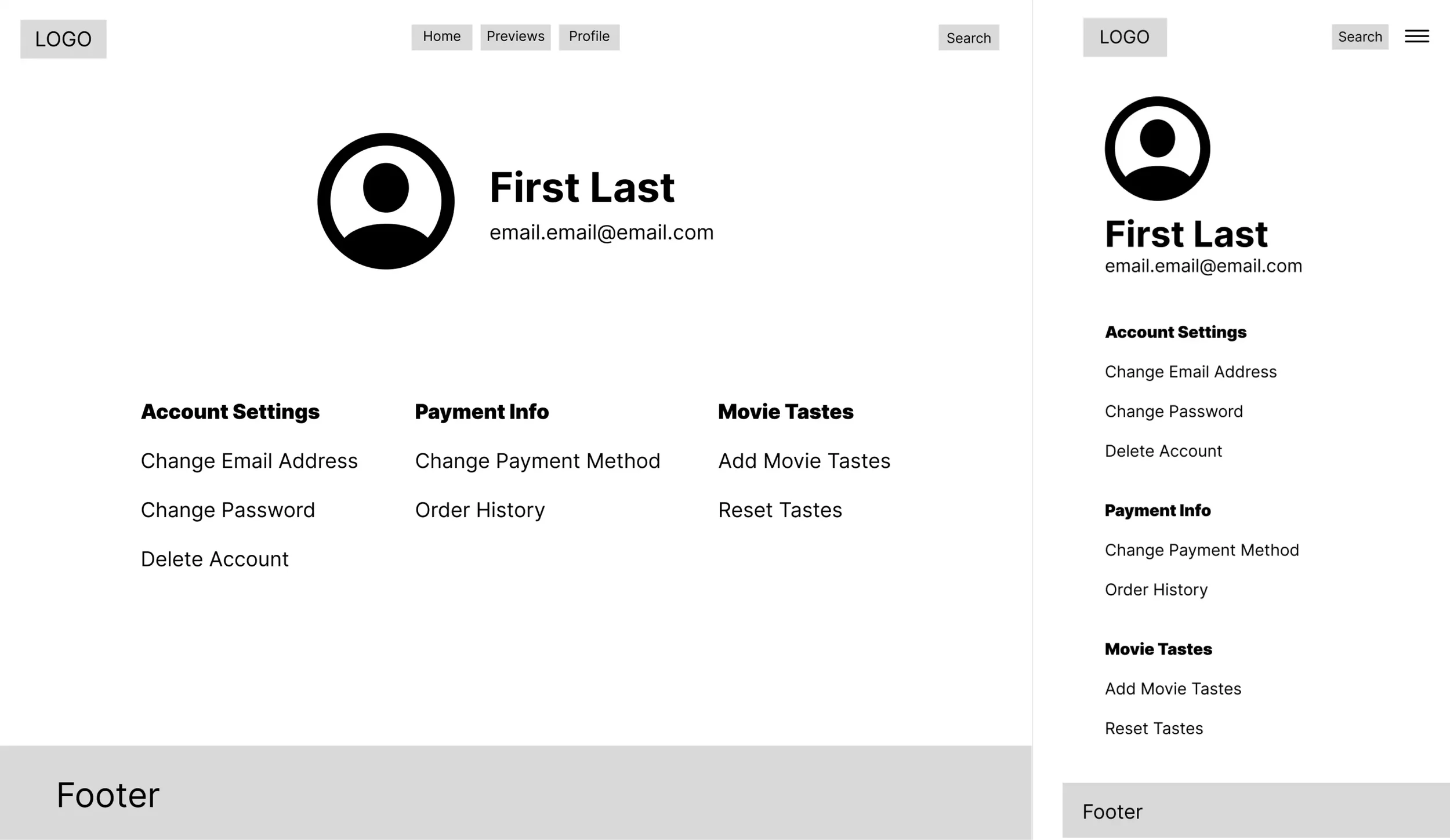
Users can manually add or reset their movie tastes, giving them control over what trailers are recommended to them on the home page.
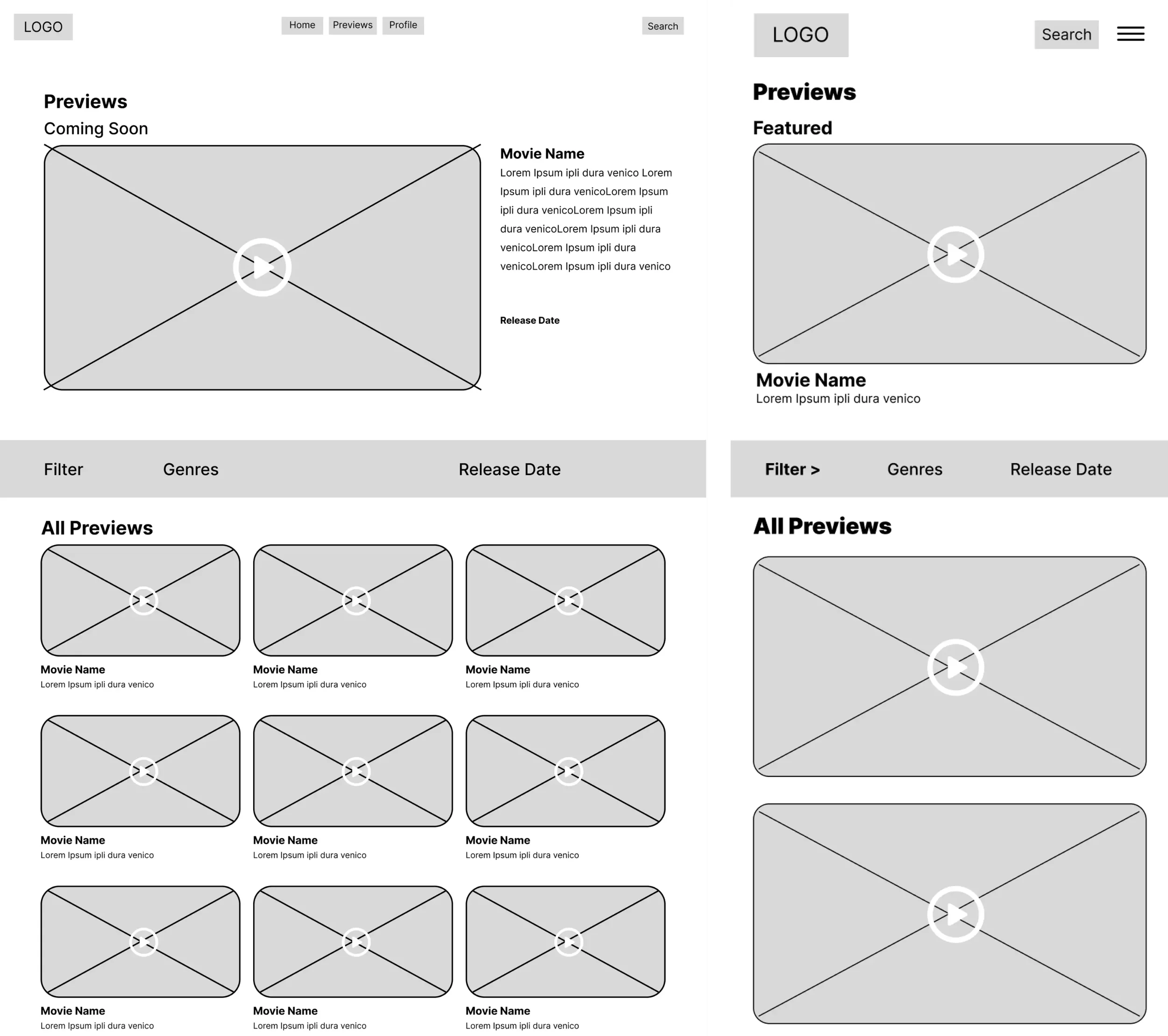
Filtering by Genre and Release Date allows users to find specific trailers they’re looking for. A clean, simple interface that lets users easily browse previews.
Usability Testing
Methodology
I recruited five participants from my personal network for one round of moderated usability testing with the low-fidelity responsive prototype. Each session lasted roughly 15 minutes. I observed task completion, navigation choices, and points of confusion across the desktop and mobile experience.
ROUND 1
Make desktop movie details more informative
EVIDENCE
4 of 5 participants wanted more information when viewing movie details on desktop.
DESIGN RESPONSE
Changed the desktop details layout from stacked to side-by-side, creating more room for the synopsis and available showtimes.
ROUND 1
Clarify the trailer-browsing destination
EVIDENCE
4 of 5 participants did not understand how the dedicated “Previews” page differed from the previews available on the Home page.
DESIGN RESPONSE
Renamed the page “All Trailers” to communicate that it contains the complete browsable trailer library.
ROUND 1
Make account settings easier to scan
EVIDENCE
3 of 5 participants found the text-only settings page difficult to scan and wanted clearer visual cues.
DESIGN RESPONSE
Added labeled icons to the settings categories to distinguish the sections and make available actions easier to identify.
FUTURE VALIDATION
The revised movie-details layout, “All Trailers” label, and settings organization should be evaluated in a future round of testing across desktop and mobile.
Study Limitation
This single-round convenience sample provided useful directional feedback but was not representative of the full intended audience. Because the resulting design changes were not tested again, future research should confirm whether they improve comprehension and navigation across both desktop and mobile.
Design Refinements
Testing surfaced three areas where the low-fidelity prototype needed clearer structure: desktop movie details, the trailer-library label, and account settings. I translated those findings into the refinements below. Because the revised designs were not tested in a second round, these changes remain design responses rather than validated outcomes.
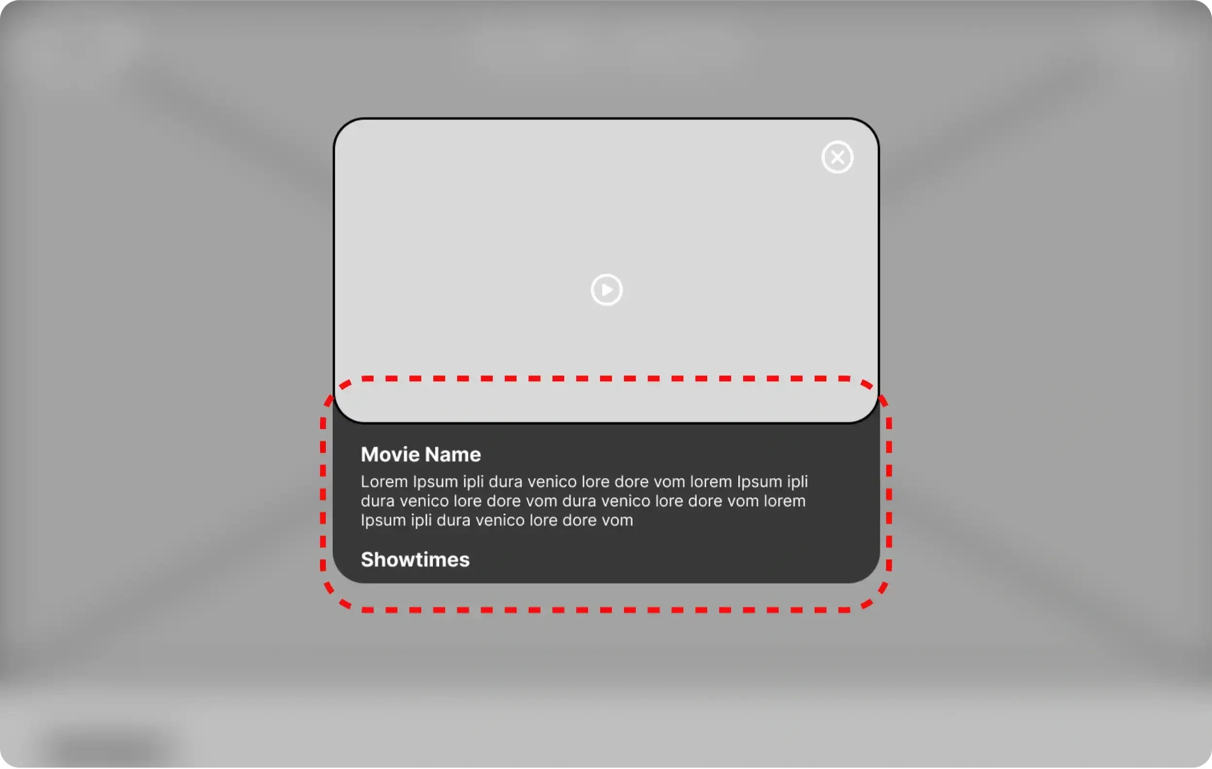
Before: Movie details were stacked beneath the trailer, limiting the space available for the synopsis and showtimes.
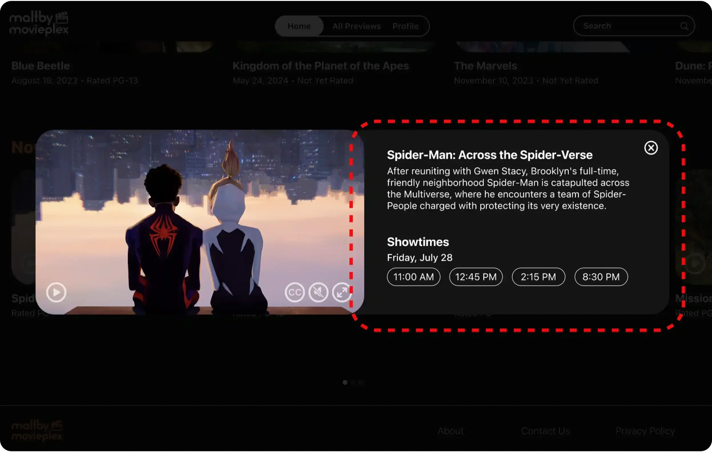
After: A side-by-side desktop layout creates more room for movie information and available showtimes.
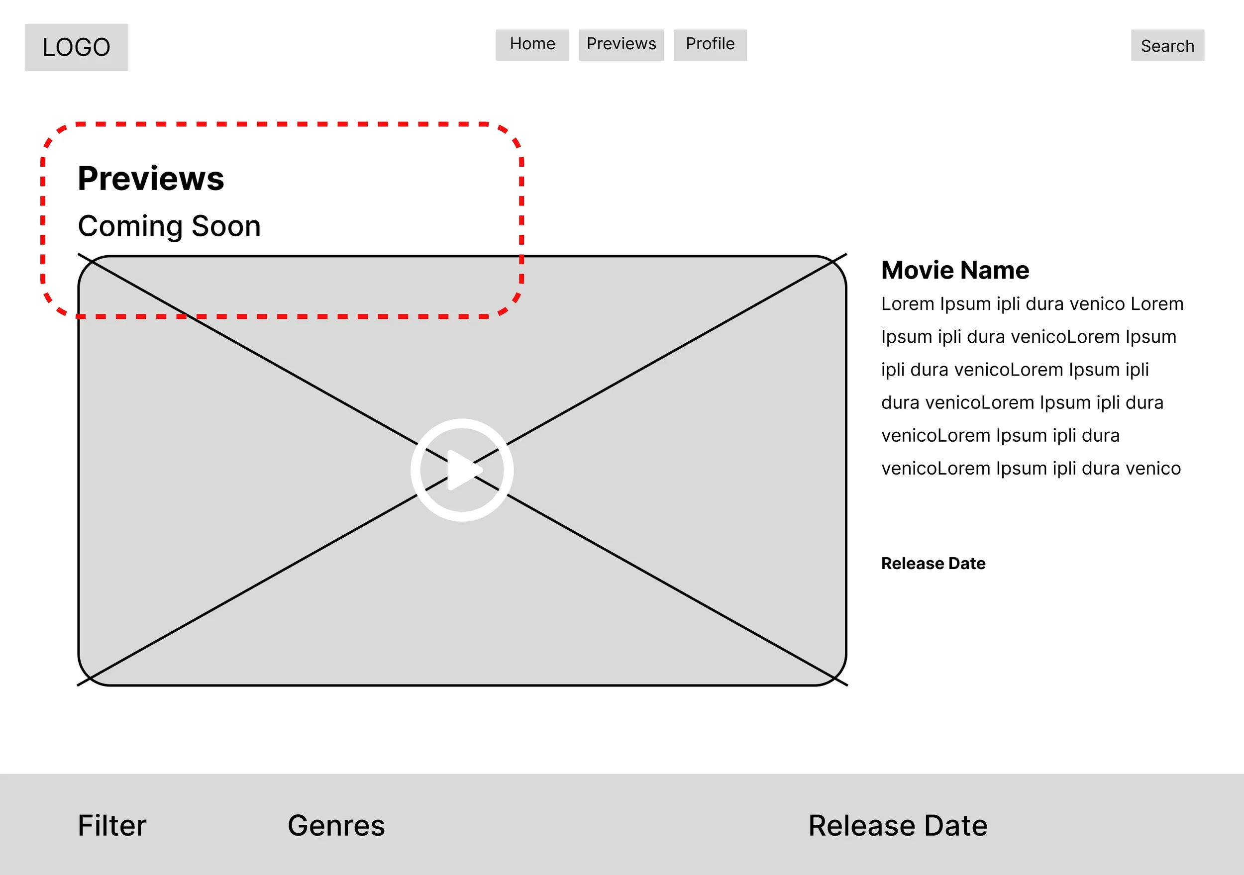
Before: “Previews” did not clearly distinguish the complete trailer library from the featured content on Home.
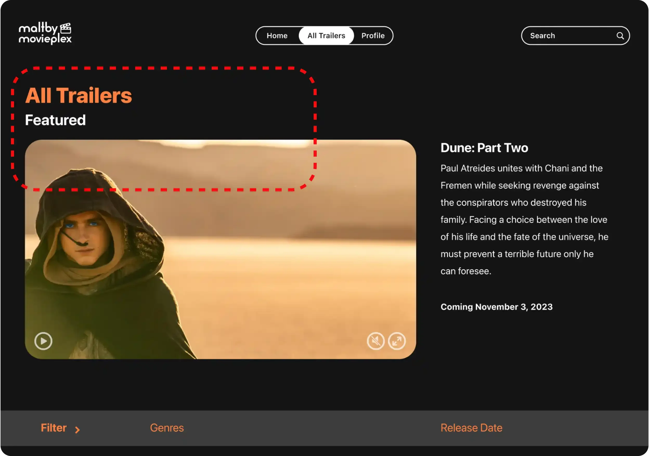
After: I renamed the destination “All Trailers” to make its purpose more explicit.
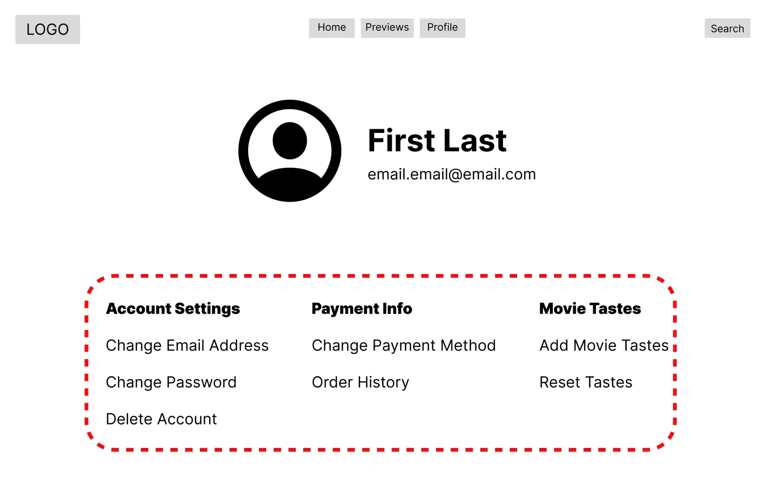
Before: Text-only settings categories were difficult to distinguish and scan quickly.
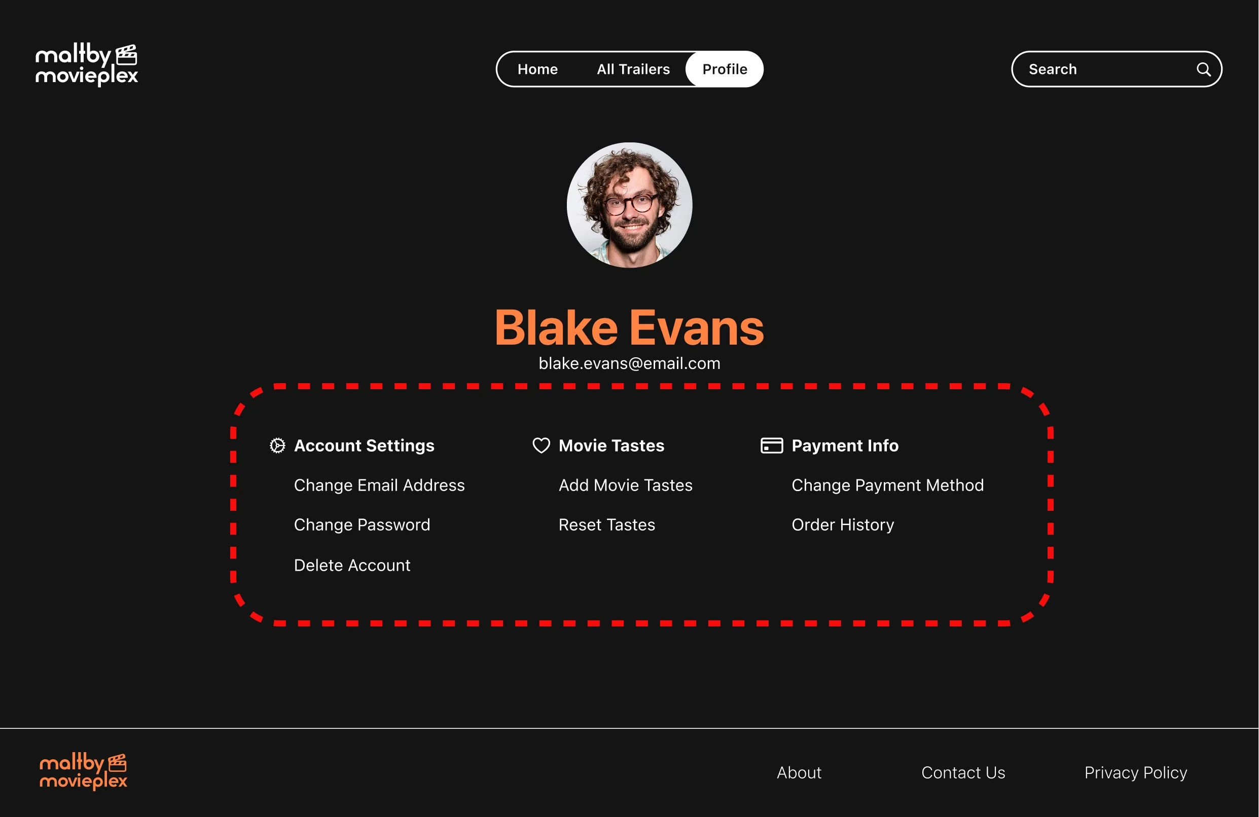
After: I paired each category with a labeled icon to create clearer visual landmarks and support scanning.
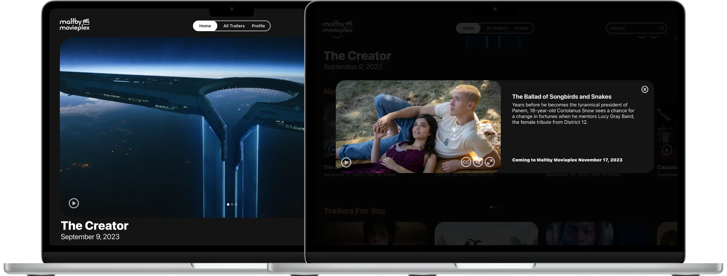
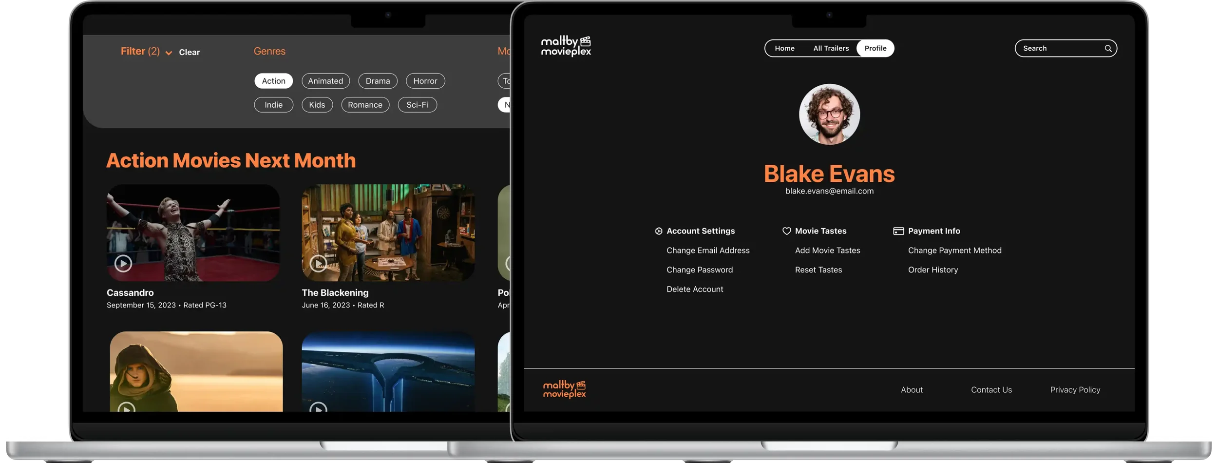
The final prototype brings the responsive system together across desktop and mobile. Both versions support the same core tasks—browsing the trailer library, reviewing movie details, filtering results, and managing account settings—while adapting navigation and content density to each screen size.
Explore the Desktop and Mobile prototypes in Figma.
Final Prototypes
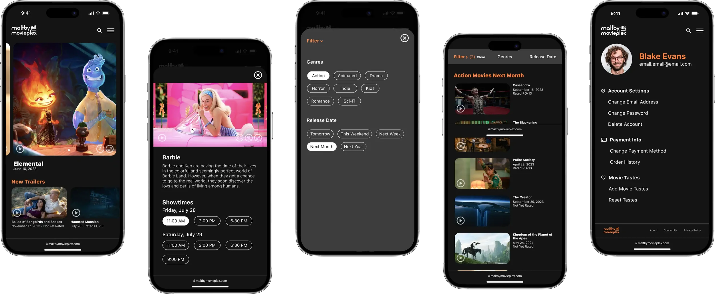
Readable Contrast
The dark interface uses light text and orange accents to create visual separation and support legibility. Exact contrast ratios should be verified in a coded build.
Accessibility Considerations
Labeled Iconography
Settings icons are paired with text labels so that actions do not depend on recognizing symbols alone.
Caption Controls
Trailer controls include a visible closed-caption option. Caption availability, accuracy, keyboard behavior, and screen-reader labeling should be validated using real video content in a coded build.
Reflection & Next Steps
What I Learned
Designing across desktop and mobile showed me that responsive design is not simply the same interface resized for different screens. Navigation, content density, and hierarchy need to adapt while preserving the same priorities. Testing also reinforced how strongly a single label or content arrangement can shape whether people understand where to go next.
What I’d Test Next
Conduct a second moderated round to evaluate the side-by-side movie-details layout, the “All Trailers” label, and the revised settings across desktop and mobile.
Extend the prototype through showtime selection and ticket checkout, then test the complete trailer-to-purchase journey with a broader participant group.
Validate caption quality, keyboard navigation, focus order, semantic labels, and contrast in a coded build with people who use assistive technology.