Trendy Tacos
Google UX Design Certificate • Individual Concept Project
A visually rich, easy-to-use food-ordering app for a taco truck, designed using Material Design 3.
Context: Google UX Design Certificate
Brief: Sharpen prompt for a food-truck ordering app
Role: Sole UX designer and researcher
Timeline: June – July 2023 • 6 weeks
Tools: Figma, Adobe Illustrator
Testing: 5 participants • 2 moderated rounds
Snapshot
The brief asked me to explore how a food-truck ordering app could reduce lunchtime wait times and make its menu easier to access for customers with low vision.
Challenge
The final prototype streamlined ordering and customization. In the second round of testing, all five participants completed the primary ordering task.
Outcome
Trendy Tacos is a fictional brand created for the Google UX Design Certificate; all design and usability-testing work shown here is my own.
Defining the Problem
Trendy Tacos began with a Sharpen-generated prompt rather than a real client brief. I used a fictional proto-persona and journey map to explore two design hypotheses: customers with short lunch breaks may benefit from ordering ahead, and customers with low vision may need access to the menu before reaching the truck. These assumptions shaped the first prototype and still require validation with a representative audience.
Research Framing
Time-Sensitive Ordering
Customers with short lunch breaks may benefit from browsing and ordering before they arrive.
Menu Access
Customers with low vision may need access to the menu before reaching the order window.
Needs From the Brief
Make the menu available before arrival
Support ordering ahead
Prepare the design for future testing with people who use assistive technology
Opportunity Areas
Devin is a fictional proto-persona—not a research participant—used to keep the concept focused on limited lunch time and low-vision access.
Design needs explored:
Browse the menu before reaching the truck
Complete an order within a short lunch break
Access readable, clearly structured content
Proto-Persona
I began with paper sketches to quickly compare menu structures and navigation patterns. I then translated the strongest direction into digital wireframes, refining the hierarchy and ordering flow before building a testable prototype. Across both stages, I focused on making the menu easy to scan and reducing unnecessary steps between browsing and checkout.
Ideate & Prototype
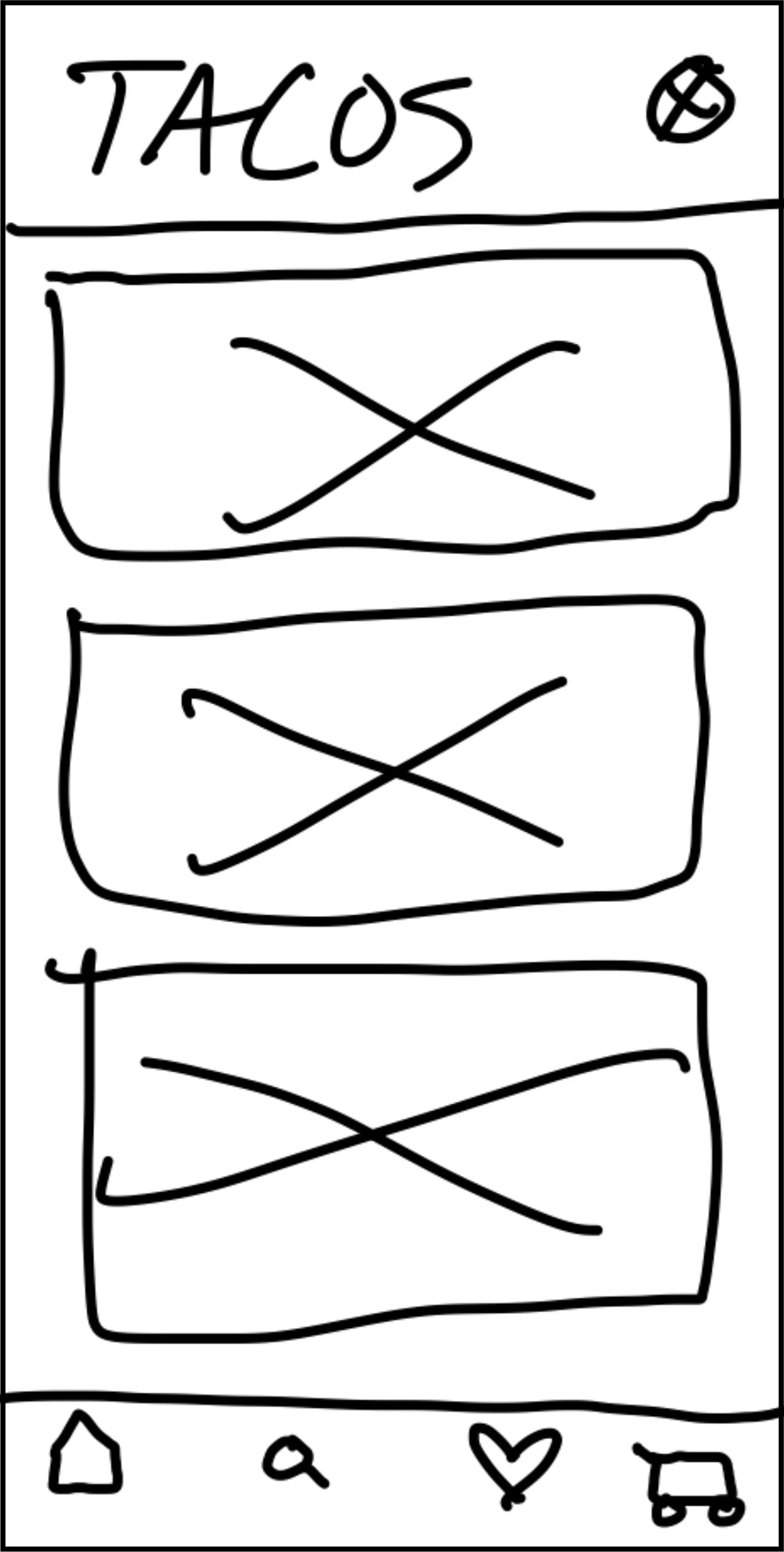
Paper Wireframes
Exploration 1 — Large menu imagery gave each item visual weight, but left little room for descriptions and created a flat hierarchy.
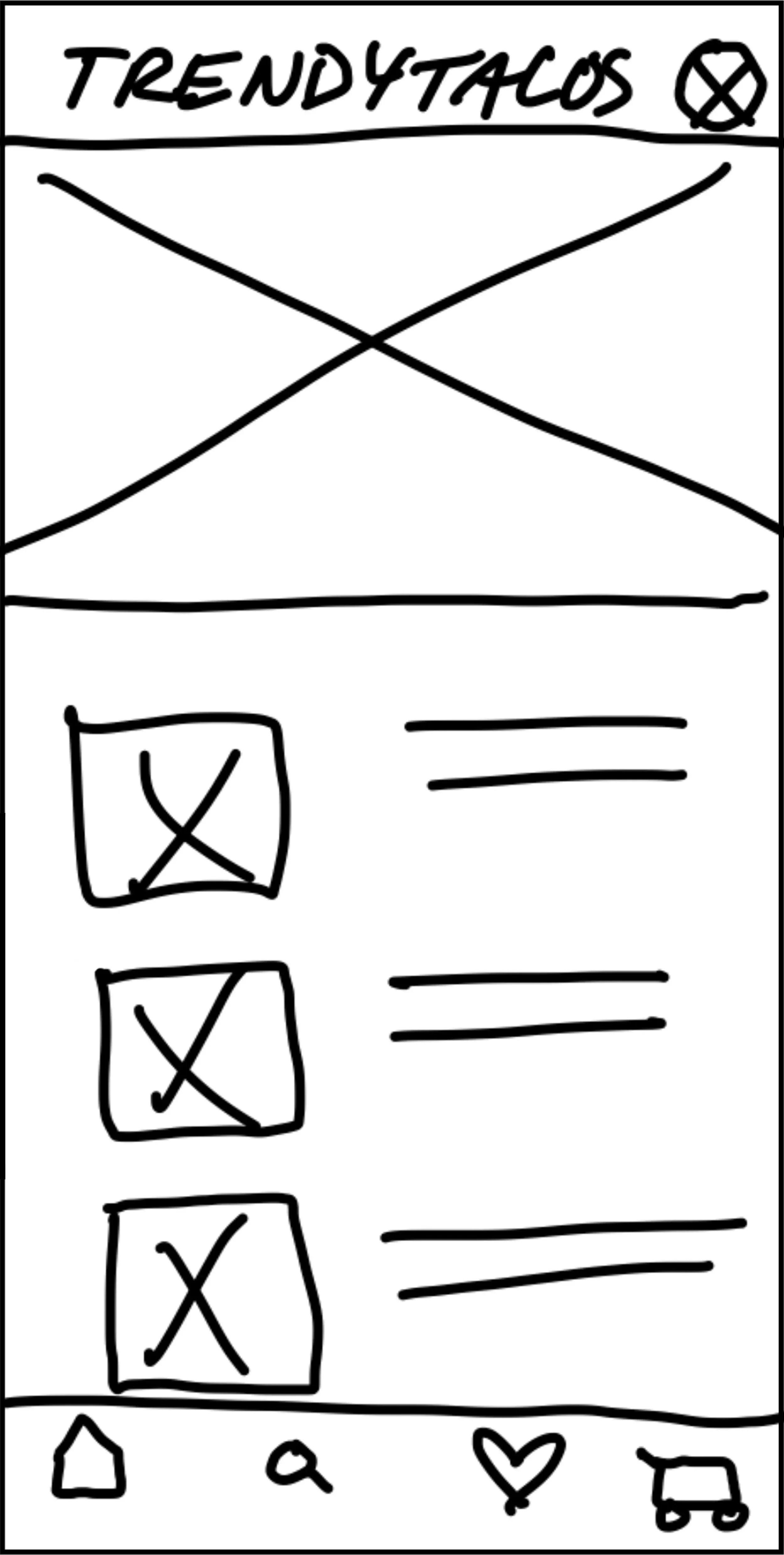
Selected direction — I kept the featured-item hero and shifted the remaining categories into horizontal rows, creating room for images, names, descriptions, and prices.
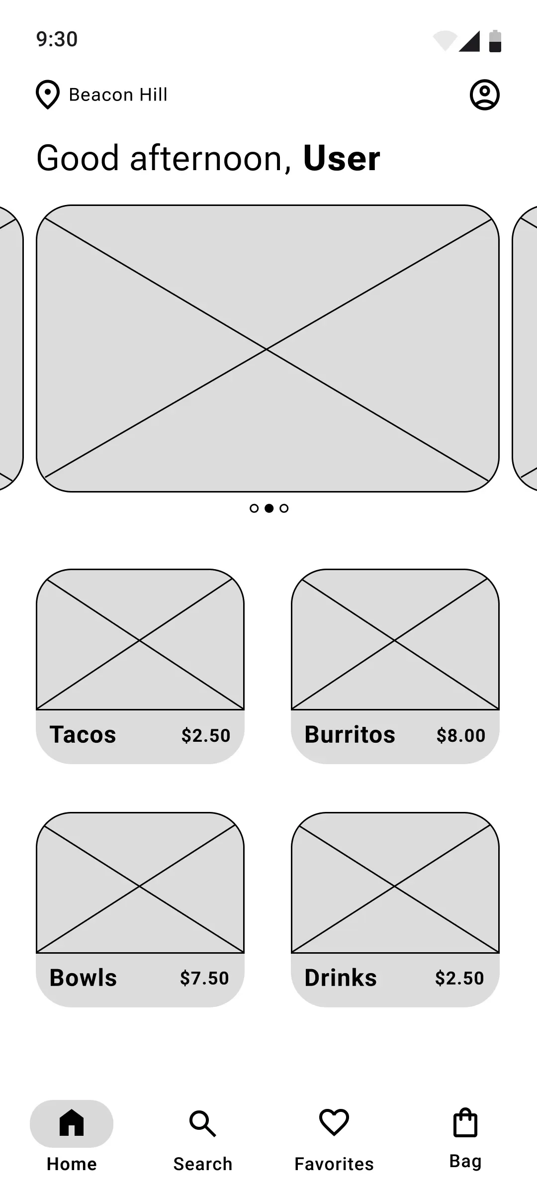
Digital Wireframes
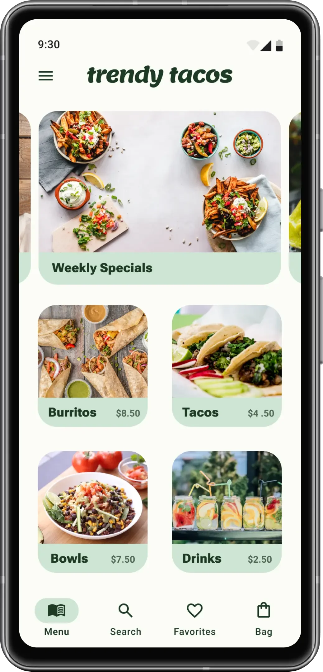
Menu hierarchy — Category cards separated the menu into scannable groups without crowding the screen.
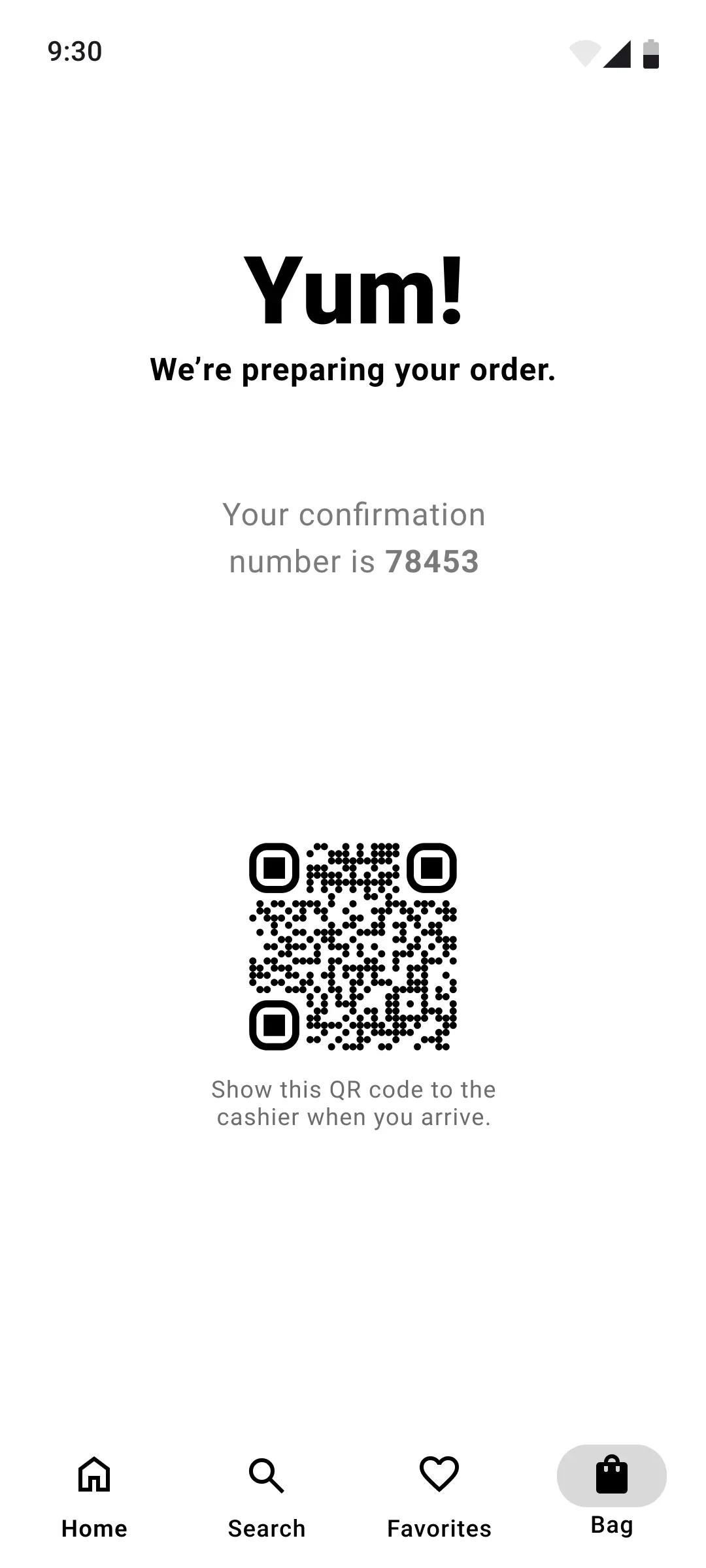
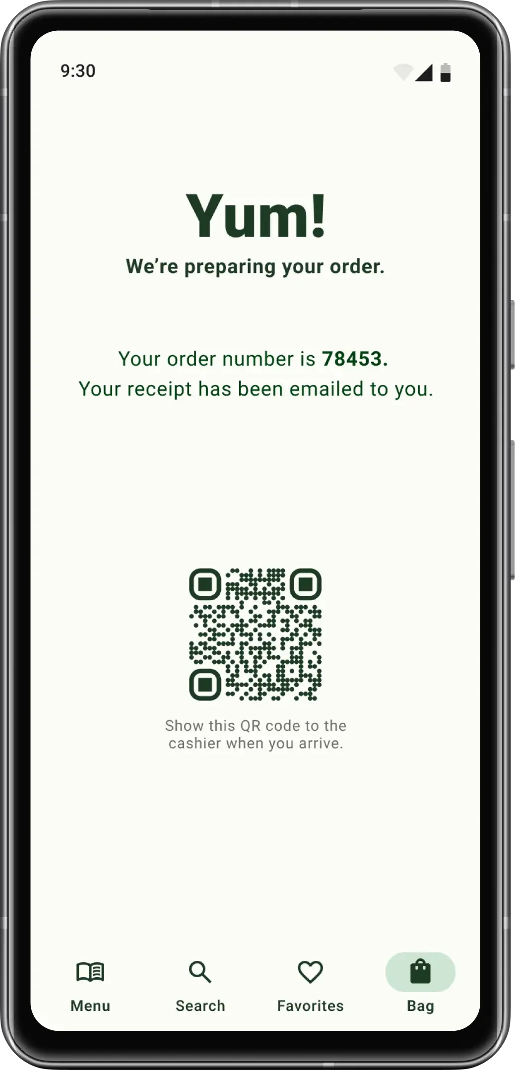
Pickup confirmation — The confirmation screen paired an order number with a QR code to support a quicker handoff at the truck.
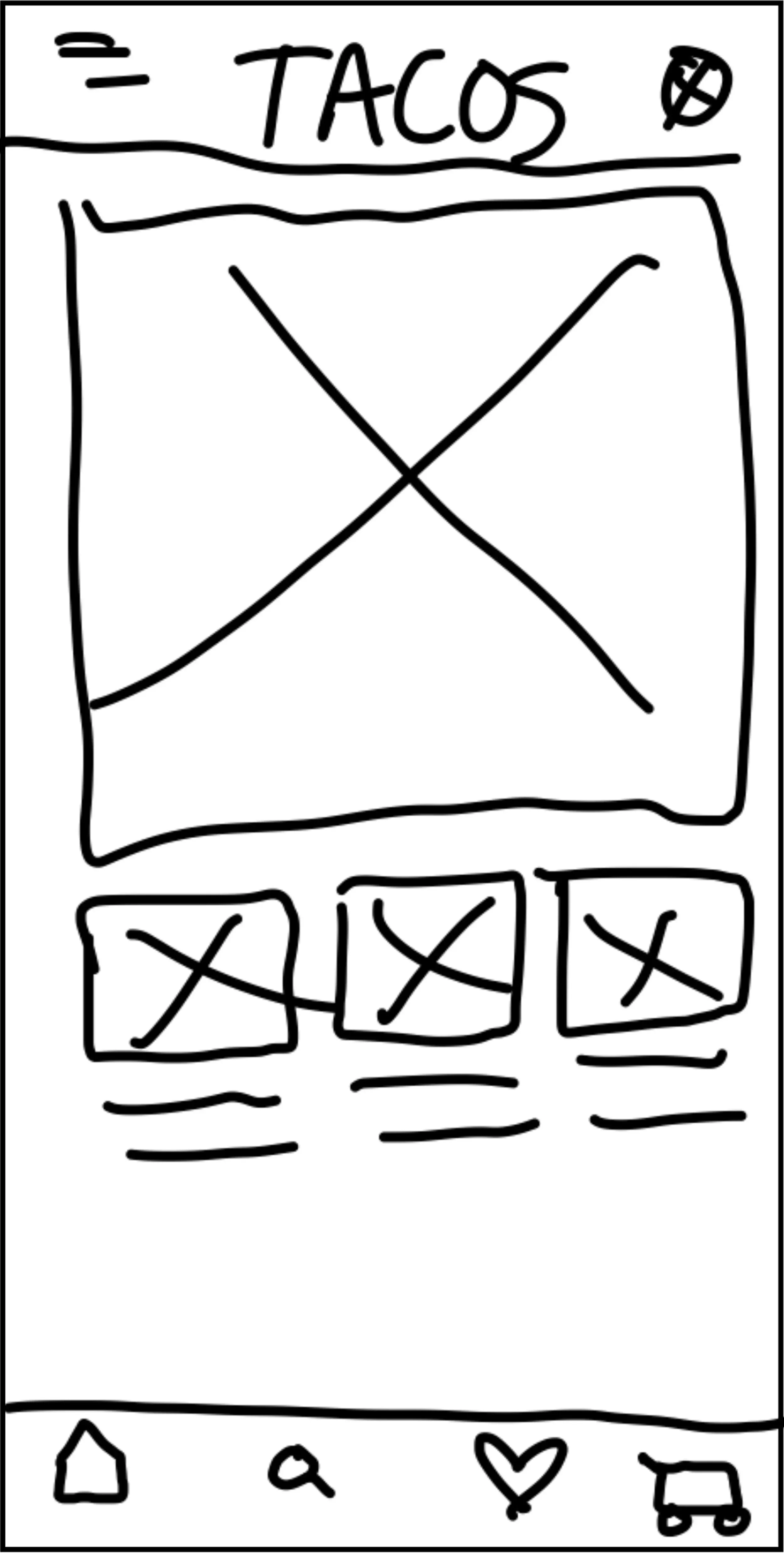
Exploration 2 — A featured-item hero introduced hierarchy, but the category cards still left limited room for supporting details.
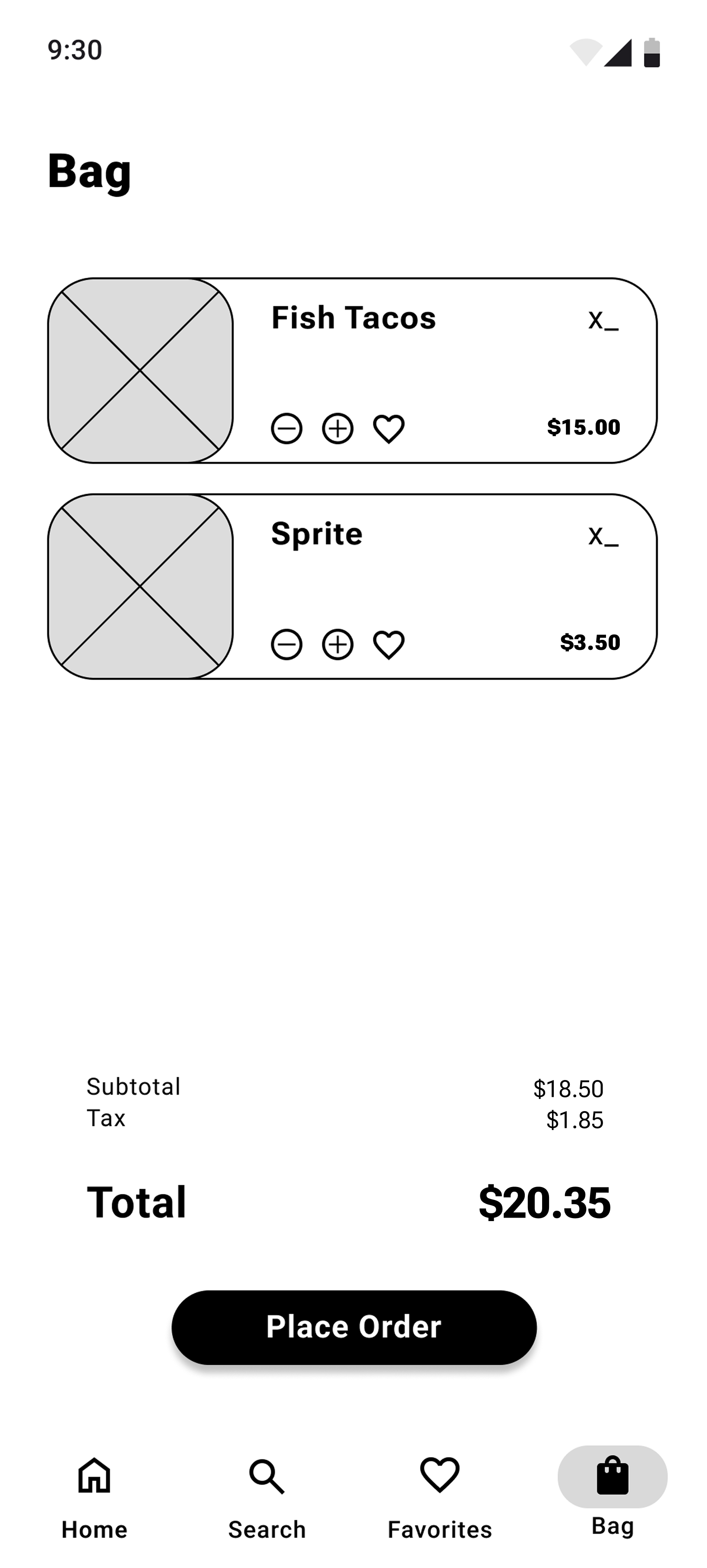
Visible customization — The bag kept item selections visible so customers could review their choices before checkout.
Usability Testing
I recruited five participants from my personal network for two rounds of moderated usability testing. With their permission, I recorded their prototype sessions to review task completion, navigation paths, and points of friction.
Methodology
ROUND 1
Make drinks easier to add
EVIDENCE
4 of 5 participants found adding drinks tedious because the flow sent them back to the Home screen.
DESIGN RESPONSE
Added a drink entry point within the ordering flow to reduce backtracking.
ROUND 2
Match navigation labels to the task
EVIDENCE
3 of 5 participants found the ‘Home’ label disruptive while they were ordering.
DESIGN RESPONSE
Renamed “Home” to “Menu” so the label matched the destination and task.
ROUND 2
Improve menu readability
EVIDENCE
2 of 5 participants reported that some menu text was difficult to read
DESIGN RESPONSE
Increased text size and contrast across menu descriptions.
ROUND 2 VALIDATION
5 of 5 participants completed the primary ordering task.
Study Limitation
This convenience sample provided useful directional feedback but was not representative of the full intended audience. Future testing should include a broader participant group, particularly people with low vision and people who use assistive technology.
Design Refinements
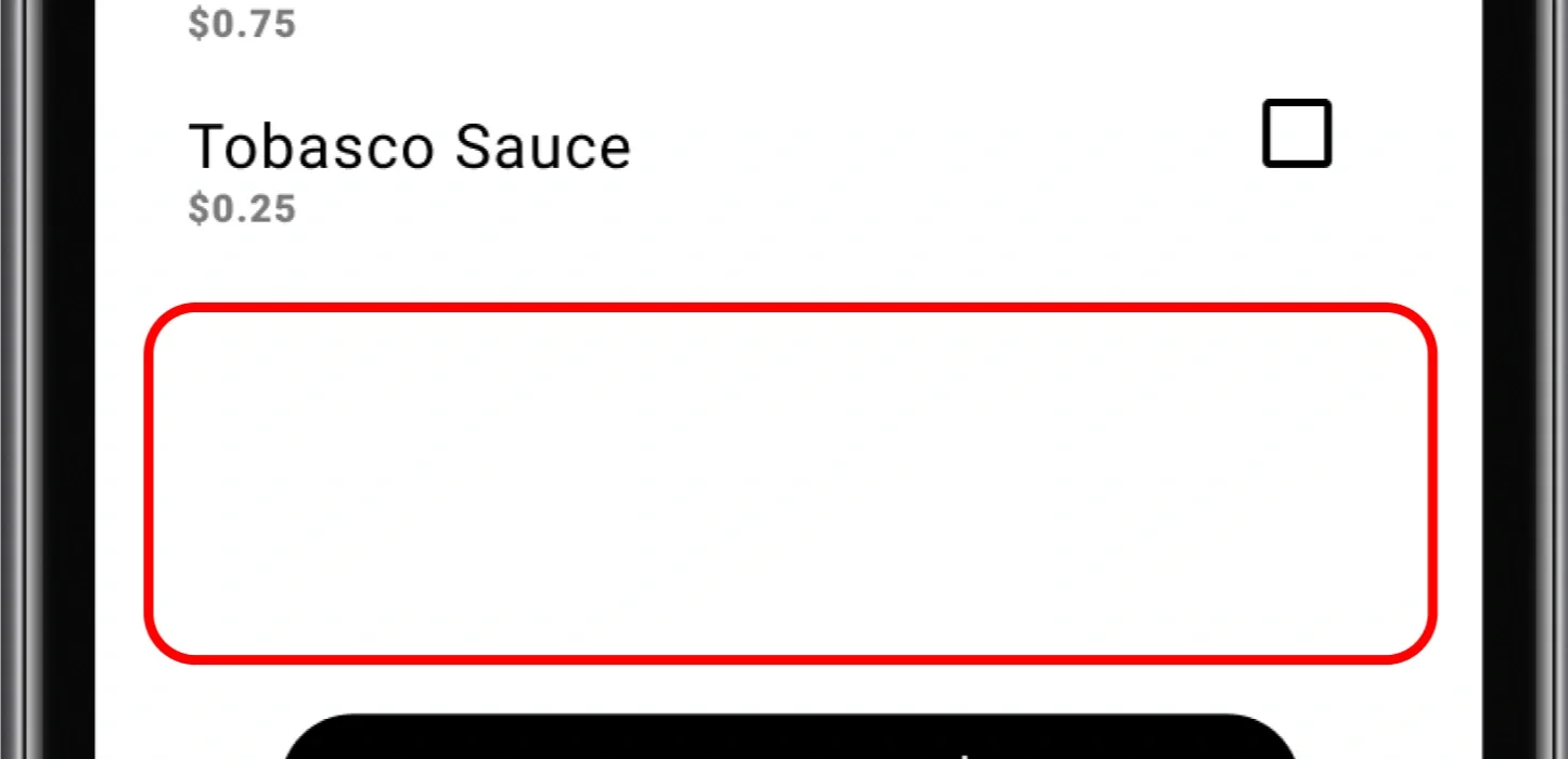
Before: Drinks missing from the item flow
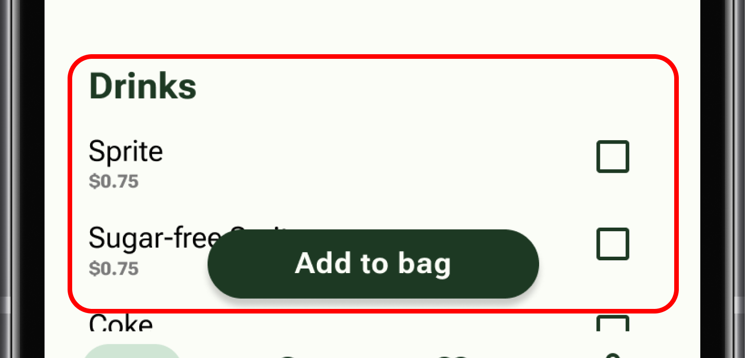
After: Added drinks to the item flow
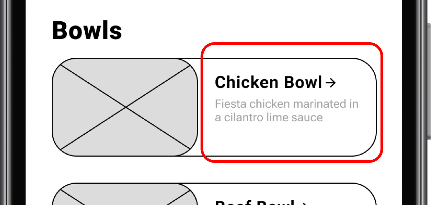
Before: Menu description difficult to read
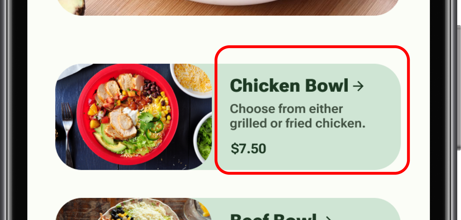
After: Increased menu readability
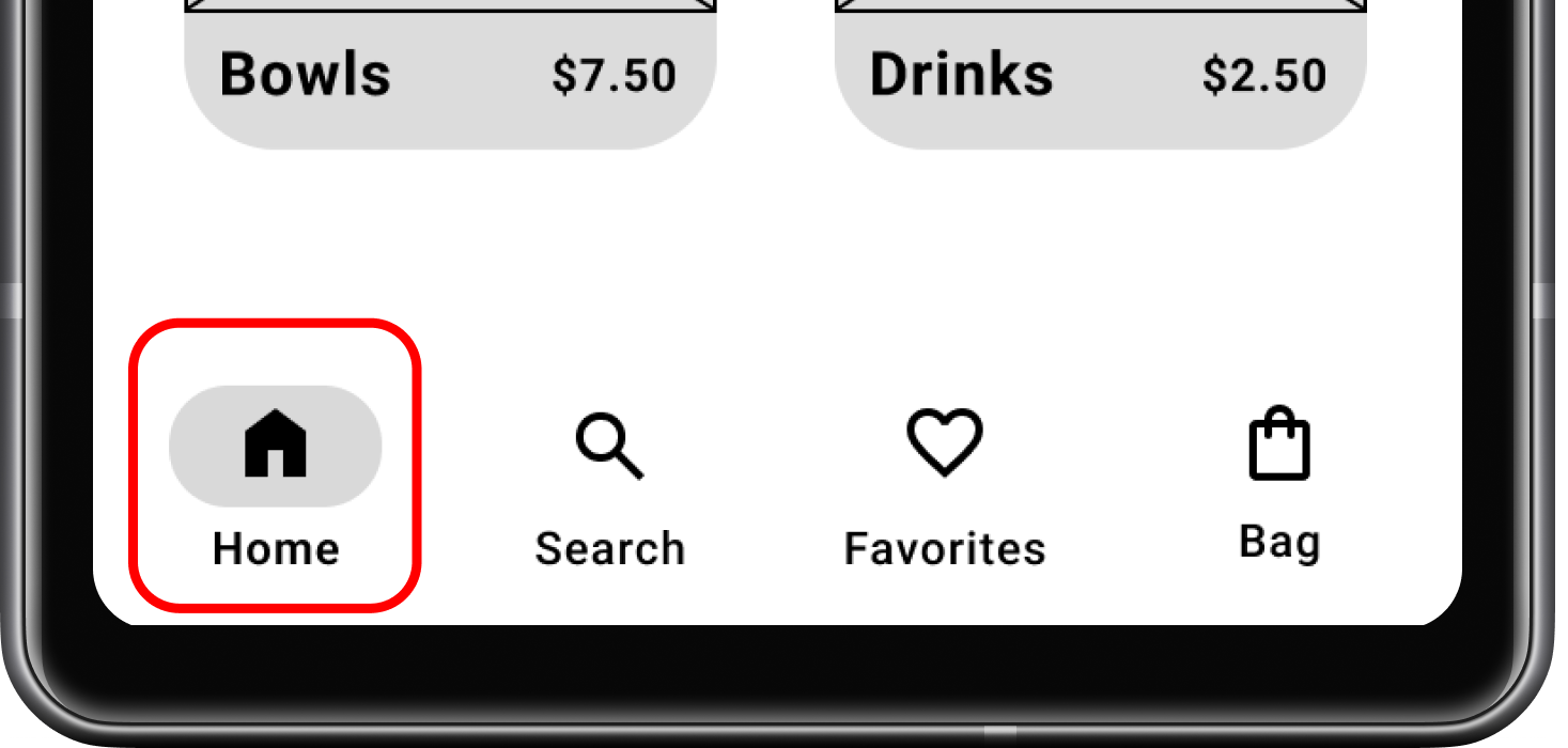
Before: “Home” mismatched the destination
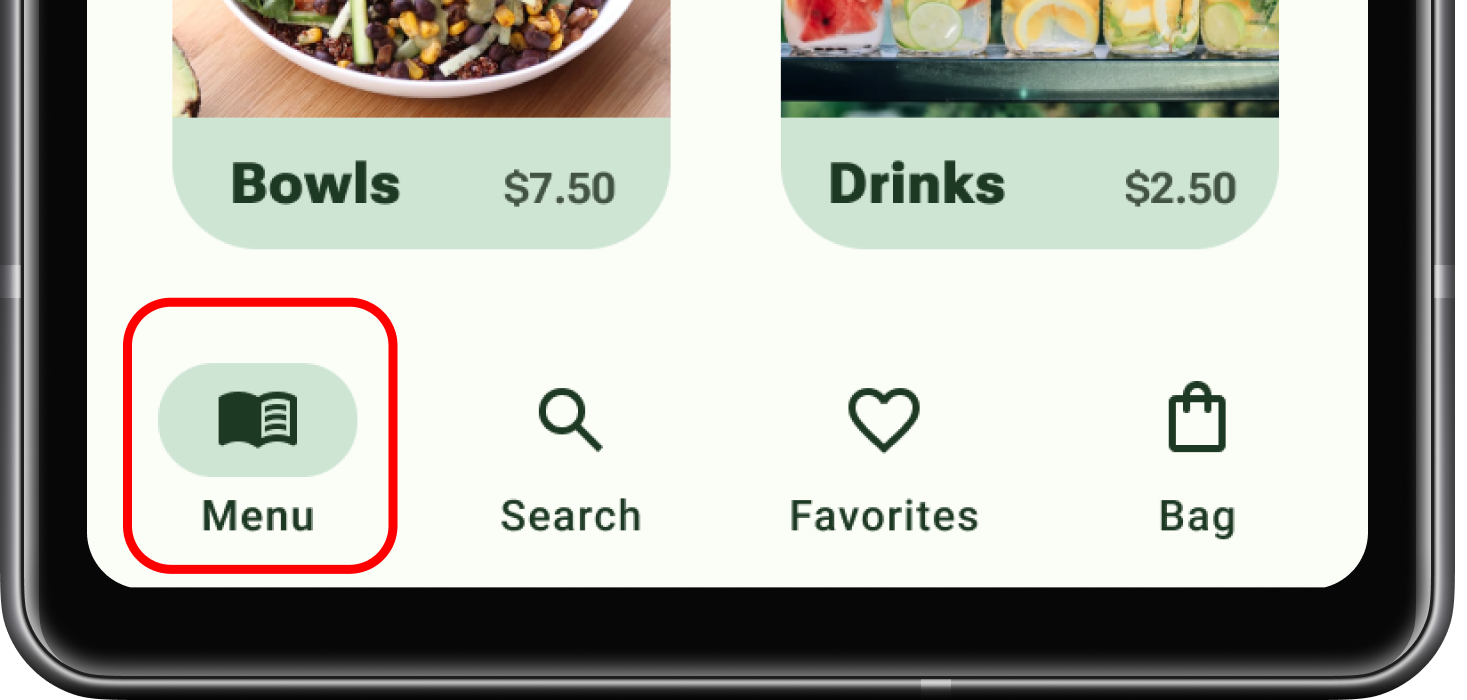
After: Renamed “Home” to “Menu”
Final Prototype
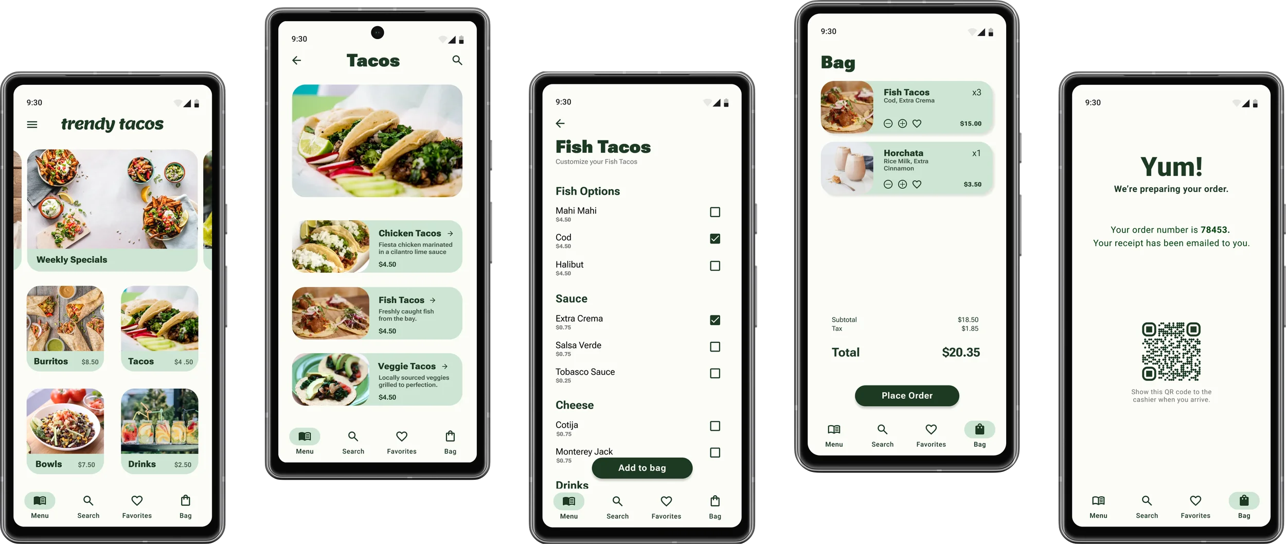
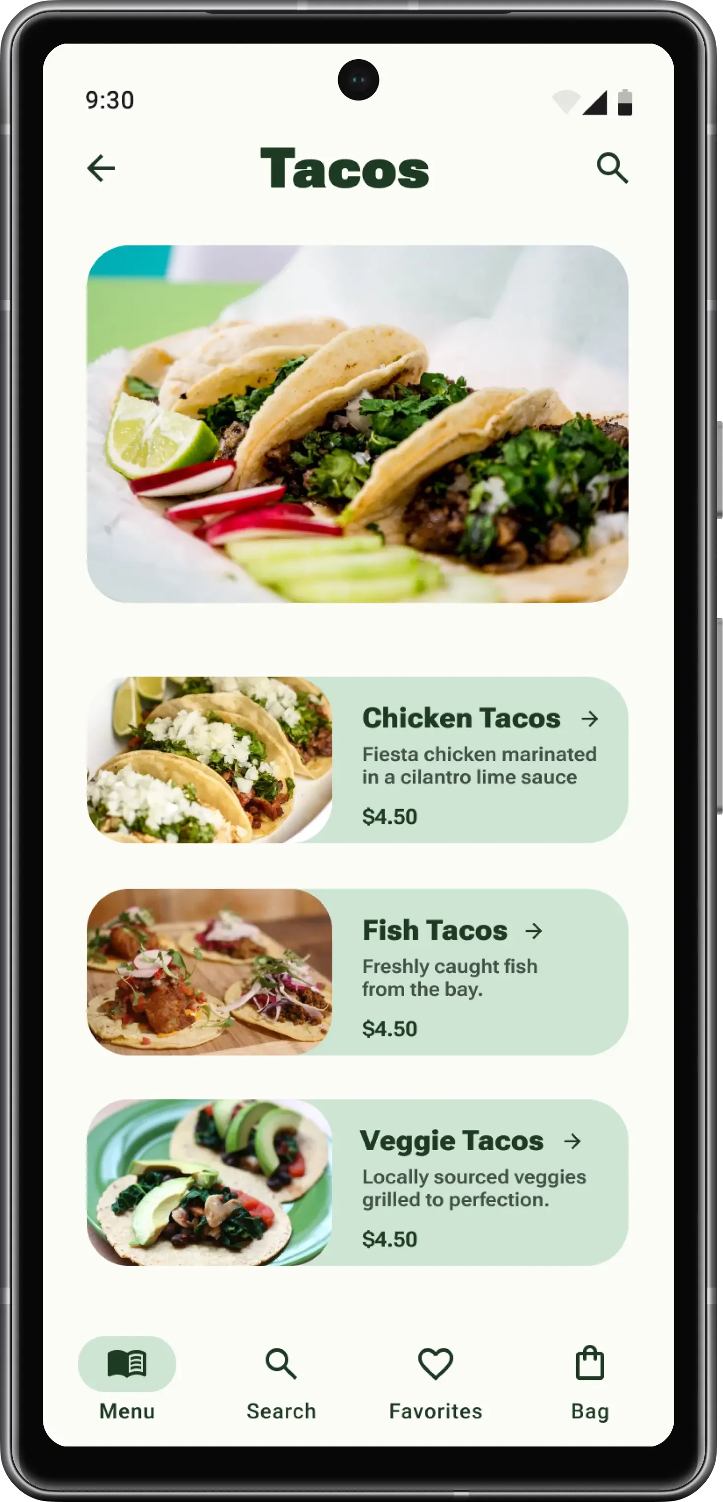
The final screens below highlight three key moments in the browse-to-pickup experience: scanning the menu, exploring the taco selection, and receiving a clear order confirmation with pickup details. View the live prototype in Figma.
Accessibility Considerations
Readable menu content
Increased menu-description size and contrast after participants reported difficulty reading it.
Redundant information
Paired food imagery with written item names and prices so choices did not rely on images alone.
Future validation
The prototype was designed with accessibility in mind, but screen-reader and low-vision testing should be completed in a coded build before compatibility is claimed.
Reflection & Next Steps
Testing showed me how quickly seemingly small decisions—navigation labels, entry points, and text hierarchy—can interrupt an ordering flow. It also reinforced the importance of separating directional feedback from validated accessibility outcomes.
What I Learned
Recruit participants with low vision and people who use screen readers to evaluate the menu’s readability, labels, and reading order.
Test the complete browse-to-pickup flow with a broader participant group, including customization, pricing, checkout, and confirmation.
Validate keyboard navigation, semantic labels, contrast, and screen-reader behavior in a coded prototype.